intro
As a data analyst or developer, this article will guide you through creating stunning visualizations with DbVisualizer.
Introduction
As a data analyst or developer, you're probably no stranger to dealing with large datasets, and we all know the importance of visualizing our data. Let's face the facts, going through large bulks of rows and columns can be tedious and overwhelming. That's where DbVisualizer comes in - a powerful tool that makes it easy for anyone, design expert or not, to create custom visualizations.
This article will guide you through creating stunning visualizations with DbVisualizer. From the tools you'll need, to the step-by-step instructions on how to create them. Whether you're a data analyst looking to make sense of your data or a developer working on a project that requires visual representation, this article is for you. By the end of it, you'll have the knowledge and skills to turn your data into meaningful insights.
Getting Started
Are you ready to dive into the world of data visualization? Great! Let's get started by using DbVisualizer to connect to our database server. Don't worry if you're new to this process, just follow the step-by-step guide and you'll be a pro in no time.
Step 1: Connecting To The Database Server
First, we'll need to use the DbVisualizer program to establish a connection to our database server. To establish a connection to a database server in DbVisualizer, create a new database connection from the "Create Database Connection" menu, select a driver for your database, and enter the connection details such as the name, database type, server IP, port, user account, and password. Optionally, you can specify auto commit, save database password, and permission mode. If the JDBC driver is not marked with a green checkmark, you may have to configure the driver in the Driver Manager. Verify the network connection and click "Connect" to access the database.
Once you've successfully established a connection, all of your databases will appear on the left side of the screen. Now, it's time to create a new database for this tutorial. The process is simple, just right-click on "Databases" and select "create database." It's that easy! So, let's get started and create a new database that will be the foundation for all of your future projects.

Step 2: Creating The Database Table
After connecting to the database server, you would want to create a new table next. All you need to do is right-click on the "Tables" option in your document and select "Create Table".

The “Create Table” dialog will be displayed. Give your database a name that reflects its purpose and content. Next, add columns to your database by clicking the handy "+" button on the right side of the dialog box. Once you've finished customizing your columns, it's time to bring your database to life. Simply click on "Execute", and voila! Your database is ready for use.

Don't let the technicalities intimidate you; working with databases in DbVisualizer has never been easier.
You will now be able to find your table in the list of tables in your database.
Step 3: Import Table Data
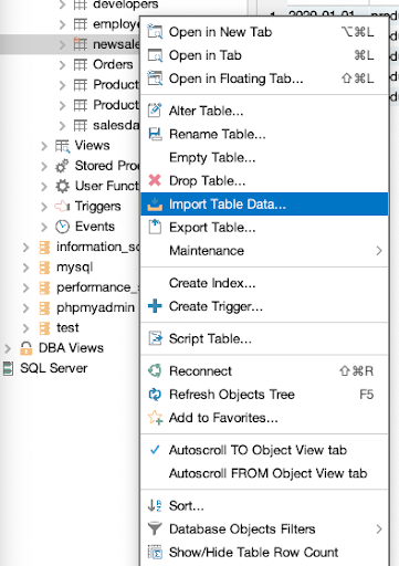
For this part, download the csv file that we'll be using throughout this tutorial. To impor thet data into your newly created table, right-click on the table and select the option "Import Table Data." An import wizard will come up, allowing you to import data from any source, including Excel and CSV files. Not only is this a quick and convenient way to populate your table with data, but it also ensures that your data is properly formatted and ready to be analyzed.

Select the downloaded CSV file from your pc and import it.

Navigate through the pages by clicking on the "Next" button until you reach the final page. Once you have reached the last page, initiate the import process by clicking on the "Import" button. If all goes well, you will get a success message indicating that your data has been imported successfully. Don't fret if you don't see this message, double check your steps and try again.

Your database will be populated with data from the CSV file and would be displayed in DbVisualizer.

Creating the Visualizations
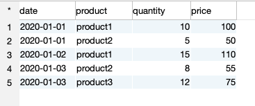
Now that our table is fully populated, let's create our visualizations. By using SQL, we have the power to create a wide range of analytical queries on this table. Let's take a look at a few examples of what we can achieve:
1. Total sales by Product
From the table above we want to find the total sales for each product. Copy the SQL query below and run it.
                    1
                    SELECT product, SUM(quantity * price) AS total_sales


                    2
                    FROM salesdata


                    3
                    GROUP BY product
Running the query above will provide you with the results seen in the table below:

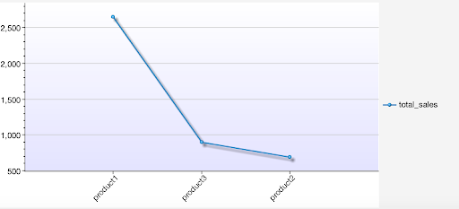
To create a visualization for this table, click on the rightmost button in the result tab toolbar.

Great! We have successfully created a visualization of our total sales data. By default, the visualization displays a line chart, but don't let that limit you. Get creative and explore the various customization options available to you. You can try out options like line chart, point chart, area chart, stacked area chart, bar chart, stacked bar chart and pie chart.

2. Total sales per day
We have successfully visualized the query for “Total sales per product”, next we want to find the total sales per day for each product in the table above. Copy the SQL query below and run it.
                    1
                    SELECT date(date) as day,


                    2
                        SUM(CASE WHEN product = 'product1' THEN quantity * price ELSE 0 END) AS product1_sales,


                    3
                        SUM(CASE WHEN product = 'product2' THEN quantity * price ELSE 0 END) AS product2_sales


                    4
                    FROM salesdata


                    5
                    GROUP BY day


                    6
                    ORDER BY day;
Running the query above will provide you with the results in the table below:

Let's bring the data to life by converting it into a visually appealing chart. First, go to the chart tab at the top of your screen. Then, click on the chart icon to reveal a dropdown menu of various chart types.

Let’s try creating a stacked area chart with our data. To achieve this, click on the button in the image provided to access the value selection options. Next, choose the product values for the y-axis and the days values for the x-axis.

Voila! Just like that we have our stacked area chart visualization.

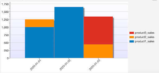
And if you prefer a stacked bar chart, here’s what it’ll look like.

Pretty neat right? DbVisualizer also allows various configuration options. To access these options, click on the tool button at the top of the chart tab. From there, you can configure your charts to best suit your needs. And once you've created the perfect chart, you can export it as an image by clicking on the document icon at the top of the chart tab.

Conclusion
Creating custom visualizations with DbVisualizer is a breeze when you know the steps. In this article, we delved into the nitty-gritty of setting up a database connection and gathering the data you need for your visualization. We also explored the various options for configuring your visualization, from adding layers to customizing the layout.
But we didn't stop there - we emphasized the importance of adding annotations to your visualization to provide context and clarity for key findings. By following the instructions outlined in this article, you'll be able to create visually compelling and informative visualizations that will help you understand your data better and communicate your findings to others.
Now that you've read the article, it's time to put your newfound knowledge to the test! Apply the concepts discussed in the tutorial to your own data, experiment with different visualization options, and take a deeper dive into the software by reading the official documentation. You can also explore ways to make your visualization more interactive and engaging for your audience. With more practice and experimentation, you'll be creating custom visualizations like a pro in no time.


