Working with Charts
Only in DbVisualizer Pro
This feature is only available in the DbVisualizer Pro edition.
Result sets in the SQL Commander and in the Monitor tools can be viewed as charts.
The chart support in DbVisualizer presents data from any result set in a configurable chart displayed in a line, bar, area or pie style. It offers much of the charting support you find in MS Excel and other specialized charting tools. Charts may be exported as an image to file, printed and copied to system clipboard for easy sharing with other tools. Charts are configured and viewed in the SQL Commander and in the Monitor tool which is really powerful, delivering real time charts of many result sets simultaneously. Charts can be opened by clicking the icon at the the rightmost button in the result tab toolbar (see below).
Here are some sample charts:
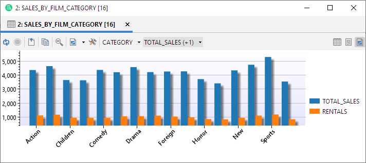

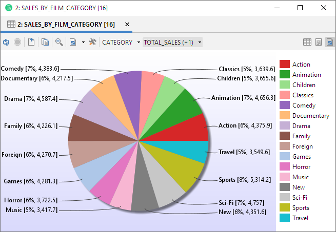
Charting a Result Set
The basic setup of a chart is really easy. Just select one or more columns that should appear as series in the chart and what column to use as the category (X-axis). Further refinement of the chart can be made in the chart preferences window.
The normal output view of a result set in the SQL Commander or Monitor window is in a grid style as shown in the following screenshot. To activate the chart view click the rightmost button in the result tab toolbar:
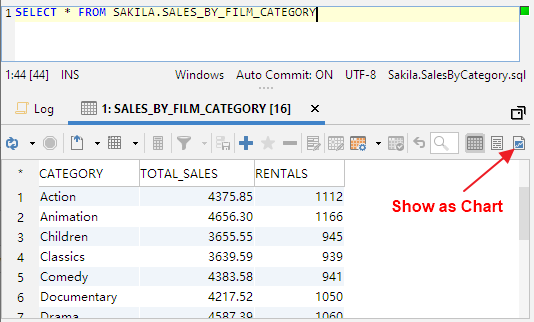
When switching to the chart view DbVisualizer automatically picks the first date or text column as the category (x-axis) for the chart and the first numeric column as the series (y-axis). In the following example it is the CATEGORY and TOTAL_SALES columns for this specific result set.
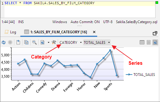
Selecting the Category
Click the category button to pick the column to use for the x-axis. Let the mouse pointer stay on a column name for a second and a tip will show what data type it is.

Selecting the Series
Click the series button to change what series to display in the chart. This drop-down stays on screen while selecting one or more series (the changes are directly propagated in the chart). To close the list either press the ESC button or click outside the list. If only one series is selected then its name is listed in the button label. If additional series are selected then the number of selected series are listed in parentheses. Only columns that are of number data types can be selected as series.
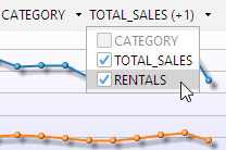
Tip: Press the ALT key while selecting a series and all currently selected series will be de-selected.
This is the chart after applying category and 2 series:
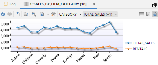
Chart Type
A chart can be displayed as one of several types. Select what type to use in the toolbar or on the right-click menu (which also offers some other controls):

Note: For the Pie chart, only one series can be selected.
Chart Configuration
The chart can be configured to your preferences for titles, colors, legend position, etc. You can also set alternative names for the series in the chart. All appearance settings are automatically re-used when running subsequent queries in the SQL Commander during the same DbVisualizer session. If you save a query as a bookmark script then all appearance settings are saved with the chart. Loading the script at a later time will also load the chart settings.
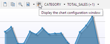
Open the chart configuration dialog from the toolbar or the right-click menu:
Appearance Preferences
In the Chart Configuration panel, use the controls in the General tab to customize the layout and style of the chart (click the information button to show/hide information about the selected setting at the bottom of the window).

Series Preferences
The default name of the series is the column name in the result set. In the Series tab you can set an alternative label name and also control what series should be visible.
Changes in the Series tab are propagated directly in the chart.

Saving/Loading Preferences
You can also save or load default preferences by clicking the Settings button in the lower left corner:

Zooming
Charts support zooming by selecting a rectangle in the chart area. Selecting another rectangle in that zoomed area will zoom the chart even further, and so on. To unzoom one level, click the Zoom Out button.
Note: You cannot zoom pie charts.
Export
Charts can be exported in PNG, GIF or JPG formats.
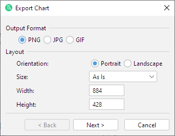
The default size of the exported image is the same as it appears on the screen. To change the size, either select a pre-defined paper size in the Size list or enter a size in pixels.