XML element - ObjectsActionDef
Introduction
Objects actions (ObjectsActionDef) define what operations are available for the object types defined in the ObjectsTreeDef. Object actions are powerful, as they offer an extensive number of features to define actions for almost any type of object operation.
In DbVisualizer, the object actions menu is accessed via the right-click menu in the Databases tab or via the Actions button in the object view.
The right-click menu in the Databases tab is context sensitive meaning that the listed actions in the menu depends on the selected object type.
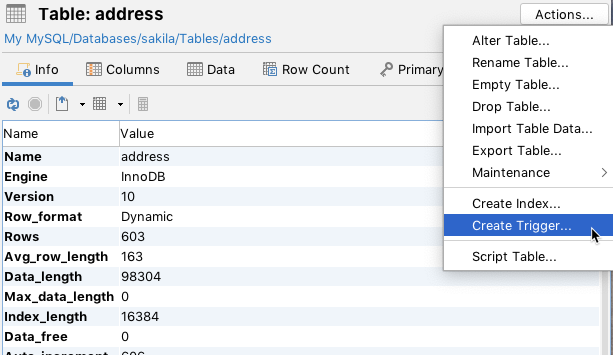
All of the operations for the current Table object in the figure above are expressed in the ObjectsActionDef section in the database profile. The implementation for these actions are either declared entirely in XML via standard definitions, or via custom definitions. (The Java API for action handlers is not yet documented). The following screenshot shows the dialog appearing when executing an action via a standard XML definition:

The first field in the dialog, Database Connection, is always present and shows the alias of the database connection the current object is associated with. At the bottom, there is a Show SQL control that, when checked, displays the final SQL for the action. The bottom right buttons are used to run the action (the label of the button may be Execute or Script based on the action mode), or to Cancel the action completely.
Variables
Variables are used to reference data for the object for which the action was launched, and the data for all its parent objects in the objects tree. Variables are also used to reference input data specified by the user in the actions dialog. Variables are typically used in the Command, Confirm, Result and SetVar elements.
Variables are specified in the following format:
${variableName}
The following is an example for a Rename Table action. It first shows the name of the database connection (which is always present) with information about the table being renamed. The last two input fields should be entered by the user and identify the new name of the table. The New Database component is a list from which the user should select the name of the new database. The new table name should be entered in the New Table Name field.
If the Show SQL control is checked, you will see any edits in the dialog being reflected immediately in the final SQL Preview.

The complete action definition for the previous Rename Table action is as follows:
<Action id="mysql-table-rename" label="Rename Table" reload="true" icon="rename">
  <Input label="Database" style="text" editable="false">
    <Default>${catalog}</Default>
  </Input>

  <Input label="Table" style="text" editable="false">
    <Default>${objectname}</Default>
  </Input>

  <Input label="New Database" name="newCatalog" style="list">
    <Values>
      <Command><SQL><![CDATA[show databases]]></SQL></Command>
    </Values>
    <Default>${catalog}</Default>
  </Input>

  <Input label="New Table Name" name="newTable" style="text"/>

  <Command>
    <SQL>
      <![CDATA[
rename table `${catalog}`.`${objectname}` to `${newCatalog}`.`${newTable}`
      ]]>
    </SQL>
  </Command>

  <Confirm>
    <![CDATA[
Confirm rename of ${catalog}.${objectname} to ${newCatalog}.${newTable}?
    ]]>
  </Confirm>

  <Result>
    <![CDATA[
Table ${catalog}.${objectname} renamed to ${newCatalog}.${newTable}!
    ]]>
  </Result>
</Action>
First, there is the Action element with some attributes specifying the label of the action, icon and whether the objects tree (and the current object view) should be reloaded after the action has been executed.
The next block of elements are Input fields defining the data for the action. As you can see in the example, there is a ${catalog} variable in the Default element for the Database input and an ${objectname} variable in the Default element for the Table input. The values for these variables are fetched from the current object in the objects tree (GroupNode or DataNode). Variables are evaluated by first checking if the variable is in the scope of the action dialog (i.e., another input field), then if the variable is defined for the object for which the action was launched, and then if it is defined for any of the parent objects until the root object in the tree (Connections node) is reached. If a variable is not found, its value is set to (null).
In the XML sample, the value of the ${catalog} variable is the name of the database in which the table object is stored. The ${objectname} is the current name of the table (these variables are described in the ObjectsTreeDef section).
The New Database input field is a list component showing a list of databases based on the result set of the specified SQL command. The Default setting for the database will be the database in which the table is currently stored based on the ${catalog} variable.
The New Table Name input field is a simple text field in which the user may enter any text (the new table name).
Both the New Database and New Table Name fields are editable and should be specified by the user. This data is then available via the variables specified in the name attribute, i.e., newCatalog and newTable.
The Command element declares the SQL statement that should be executed by the action. In this example, the SQL combines static text with variables.
XML element - ActionGroup
The ActionGroup element is a container and groups a collection of ActionGroup, Action and Separator elements. It is used to define what actions should be present for a particular object type. It also define in what order the actions should appear in the menu and where any separators should be located. ActionGroup elements can be nested and these will be displayed as sub menus in DbVisualizer.
<ActionGroup type="Table">
   <Action id="xxx">
      ...
   </Action>
</ActionGroup>
The attributes for an ActionGroup are:
| Attribute | Value | Description |
|---|---|---|
| type | This defines what object type the ActionGroup is mapped to. This attribute is required and valid only for top level ActionGroup elements (not nested ActionGroup elements). An example is the Table object type, the corresponding <ActionGroup type="Table"> will only be displayed when the current object is a Table | |
| label | This attribute is required for nested ActionGroup elements and is the label displayed in the sub menu. (This attribute have no effect on top level ActionGroup elements) | |
| drop-on-condition | Read more in drop-on-condition attribute | |
| order-before | Specifies the order of this ActionGroup among a collection of ActionGroup elements located at the same level. It can either be an index starting at 0 (first) or a node type. Ex. order-before="Views" will order this ActionGroup before ActionGroup elements defined by the type="Views" attribute | |
| order-after | Specifies the order of this ActionGroup among a collection of ActionGroup elements located at the same level. It can either be an index starting at 0 (first) or a node type. Ex. order-after="Views" will order this ActionGroup after ActionGroup elements defined by the type="Views" attribute |
XML element - Action
The Action element defines the characteristics of the action. The following show the complete definition of the Drop Table action in Oracle.
<Action id="oracle-table-drop" label="Drop Table" reload="true" icon="remove">
   <Input label="Schema" style="text" editable="false">
      <Default>${schema}</Default>
   </Input>
   <Input label="Table" style="text" editable="false">
      <Default>${objectname}</Default>
   </Input>
   <Input label="Drop Referential Integrity Constraints" name="cascade" style="check"
          tip="Enable this to drop all referential integrity constraints
               that refer to primary and unique keys in the dropped table">
      <Values>cascade constraints</Values>
   </Input>
   <If test="#util.isDatabaseVersionGTE(10)">
      <Input label="Purge Space" name="purge" style="check"
         tip="Enable this if you want to drop the table and
              release the space associated with it in a single step">
         <Values>purge</Values>
      </Input>
   </If>
   <Else>
      <SetVar name="purge" value="''"/>
   </Else>
   <Command>
      <SQL>
         <![CDATA[drop table "${schema}"."${objectname}" ${cascade} ${purge}]]>
      </SQL>
   </Command>
   <Confirm>
      Really drop table ${schema}.${objectname}?
   </Confirm>
   <Result>
      Table ${schema}.${objectname} has been dropped!
   </Result>
</Action>
The available attributes for the Action element:
| Attribute | Value (bold = default) | Description |
|---|---|---|
| id | Every Action element must have a unique id which is not only unique in the current profile but also with all id's in extended profiles. The recommended format is profileName-actionGroupType-action. Ex: oracle-table-drop | |
| icon | The name of the icon that should be displayed next to the label in the actions menu | |
| label | The label for the action as it should be displayed in the list of actions and in the actions dialog | |
| reload | true/false | Specifies if the parent node (in the objects tree) should be reloaded after successful execution. This is recommended for actions that change the visual appearance of the object, such as remove, add or name change |
| mode | - script show the action dialog, process user input and send the final SQL to the SQL Commander without executing the command - script-immediate will not show the action dialog but instead pass the final SQL directly to the SQL Commander without executing the command | Specifies how the action will be prepared and displayed |
| resultaction | - mergeasscript - mergeastext | - mergeastext will merge multiple result sets to to a single result tab - mergeasscript will merge multiple result sets to a single result tab, each row will be terminated with a semi-colon (";") Default is that result sets are displayed in individual tabs |
| resulttarget | - editor | Only applicable if the resultaction attribute is specified. With the value editor the merged results will be opened in a new SQL Commander tab |
| hideif | There may be situations when an action should be dropped due to a condition. The hideif attribute is used to express a condition which is evaluated when the list of actions is created. Example: hideif="#dataMap.get('actionlevel') neq 'toplevel'" | |
| resetcatalogs | true/false | Setting this attribute to true will reset any cached databases for the actual database connection. Useful when for example the action create, rename or delete a database |
| resetschemas | true/false | Setting this attribute to true will reset any cached schemas for the actual database connection. Useful when for example the action create, rename or delete a schema |
| supportsmultipleobjects | true/false | An action support processing multiple objects if the style attribute for all input elements is one of: - check - check-list - list - radio - separator - node - label - read-only text The supportsmultipleobjects="true" attribute is used to disable multi object processing even if the previous criteria is satisfied |
| class | Used to specify a custom Java class used as the action | |
| classargs | Used to pass arguments to a custom action | |
| doclink | Relative HTML link to the related chapter in the user guide | |
| drop-on-condition | Read more in drop-on-condition attribute | |
| order-before | Specifies the order of this Action among a collection of Action elements located at the same level. It can either be an index starting at 0 (first) or a node type. Ex. order-before="View" will order this Action before Action elements defined by the type="View" attribute | |
| order-after | Specifies the order of this Action among a collection of Action elements located at the same level. It can either be an index starting at 0 (first) or a node type. Ex. order-after="View" will order this Action after Action elements defined by the type="View" attribute |
XML element - Input
An Input element specifies the characteristics of a field component in the actions dialog. The label attribute is recommended and is presented to the left of input field. If a label is not specified, the input field will occupy the complete width of the action dialog. All input fields are editable by default. The name attribute is required for editable fields and should specify the name of the variable in which the user input is stored.
| Attribute | Value (bold = default) | Description |
|---|---|---|
| label | The label for the input component | |
| name | For editable input this should be the name of the variable holding the value specified by the user | |
| tip | Message displayed when hovering over the component | |
| editable | true/false | Enables or disables editing of the component |
| linebreak | true/false | If set to true, no line break will be made after the input component. This is useful when for example having multiple <Input style="check"> elements in a single row |
| style | list, radio, text, check, check-list, password, number, text-editor, wrapped-text-editor, grid, separator, label, note | The style of the input element. See following sections for more details |
| hideif | There may be situations when an Input element should be dropped due to a condition. The hideif attribute is used to express a condition which is evaluated when the action is initialized. Example: hideif="#dataMap.get('actionlevel') neq 'toplevel'" | |
| runsetdefaultwhenvaluechanged | The runsetdefaultwhenvaluechanged attribute defines what other inputs default command should be triggered when the value for the input is changed |
This is a minimal definition of an input field. It will show a read-only text field control labeled Size.
<Input label="Size" editable="false"/>
If the input field is changed to be editable, the name attribute must be used to specify the identifier for the variable name.
<Input label=Size" editable="true" name="theSize"/>
Any input element may contain the tip attribute. It is used to briefly document the purpose of the input field and is displayed as a tooltip when the user hover the mouse pointer over it.
<Input label=Size" editable="true" name="theSize" tip="Please enter the size of the new xxx"/>
The hideif attribute is useful to limit what input fields should appear for an action. The condition specified in the hideif attribute have the same syntax as described in the <SetVar> section. Example:
<Input label="Unit" hideif="#dataMap.get('actionlevel') neq 'toplevel'">
Input fields can be aligned on a single row with the linebreak attribute. The default behavior is that every input field is displayed on a single row. Use the linebreak="false" attribute to define that the next input field will be arranged on the same line. To re-start the automatic line breaking feature you must use the linebreak="true" attribute.
<Input name="size" label="Size" style="number" linebreak="false">
  <Default>10</Default>
</Input>
<Input name="unit" label="Unit" style="list" linebreak="true">
  <Labels>KB|MB</Labels>
  <Values>K|M</Values>
  <Default>M</Default>
</Input>
The previous example show the use of the linebreak attribute. The Size number field and the Unit list will appear in the same row.
Specifying the default value as a result from an SQL statement is a trivial task:
<Input label=Size" editable="true" name="theSize">
   <Default>
      <Command>
         <SQL>
select size from systables where tablename = '${objectname}'
         </SQL>
      </Command>
   </Default>
</Input>
The Default definition above will execute a SQL statement, it will automatically pick the value in the first row's first column and present it as the default value for the input component. SQL may be specified in the Default element for all styles while SQL in Values and the Labels elements are valid only for list, radio, and check styles. In some rare situations it may not be possible to express a SQL statement that will return a single column that should be displayed for Values, Labels and Default. An example is when data is collected via a stored procedure. To solve this problem specify the column attribute. Its value must be a column name or column index in the result set.
column index (column="2" attribute):
<Input label=Size" editable="true" name="theSize">
   <Default column="2">
      <Command idref="getSize">
         <Input name"objectname" value="${objectname}"/>
      </Command>
   </Default>
</Input>
or by column name (column="THE_SIZE" attribute):
<Input label=Size" editable="true" name="theSize">
   <Default column="THE_SIZE>
      <Command idref="getSize">
         <Input name"objectname" value="${objectname}"/>
      </Command>
   </Default>
</Input>
An alternative to embedding the SQL in the element body, as in one of the previous examples, is to refer to a command via the standard idref attribute:
<Input label=Size" editable="true" name="theSize">
   <Default>
      <Command idref="getSize">
         <Input name"objectname" value="${objectname}"/>
      </Command>
   </Default>
</Input>
Instead of having duplicated SQLs in multiple actions, consider using <Command idref="xxx"> elements instead.
Referring commands in actions via the idref attribute is recommended when the same SQL is used in several actions. Use Input elements for the Command to pass parameters to the command.
The following sections presents the supported styles that can be used in the Input element.
Style - check (true/false, on/off, selected/unselected)
The check style is suitable for yes/no, true/false, here/there types of input. Its checked state indicates that the Value for the input will be set in the final variable. If the check box is unchecked, the variable value is blank.
<Input label="Cascade Constraints" name="cascade" style="check">
   <Values>compact</Values>
</Input>
- This will create a check component with the label Cascade Constraints
- Checking the check box will set the value of the variable identified by name (cascade) to the value of Value, which is compact
- If the check box is unchecked, the variable value will be blank
Style - check-list (large number non exclusive choices)
The check-list style is much like the list style except that each choice have a check box in front allowing multiple values to be selected
<Input label="Weekdays" name="weekdays" style="check-list">
   <Arg name="output" value="jschours[${value}] = true"/>
   <Arg name="newline" value=", "/>
   <Labels>Monday|Tuesday|Wednesday|Thursday|Friday|Saturday|Sunday</Labels>
   <Values>00|11|22|33|44|55|66</Values>
   <Default>22|44</Default>
</Input>
To produce a desirable output from the check-list it is possible to define how each choice should be generated in the final result. The output argument and its value attribute is used to define how each value should be generated. In the example each choice will be formatted as: jschours[22] = true. The newline argument defines any delimiter between each choice. If the user selects both Monday and Friday in the action window the following will be generated:
jschours[00] = true, jschours[44] = true
Style - grid (configurable multi row/columns input)
The grid input style is presented as a grid with user controls to add, remove and move rows. The columns that should appear in the grid are defined by using any of the primitive styles: text, number, password, check, list and radio. The grid style is useful for data that allows the user to define multiple entries. Examples are, defining columns that should appear in a table index, setup data files for a tablespace or databank.
This example show a grid style definition that will ask the user for parameters that will be part of a create procedure action.
<Input name="parameters" style="grid">
   <Arg name="output" value="${direction} ${name} ${type}${_default}"/>
   <Arg name="newline" value=", "/>

   <Input name="name" label="Name" style="text">
      <Default>p1</Default>
   </Input>
   <Input name="direction" label="Direction" style="list">
      <Values>IN|INOUT|OUT</Values>
      <Default>IN</Default>
  </Input>
  <Input name="type" label="Type" style="text">
      <Default>VARCHAR(20)</Default>
  </Input>
</Input>
Here is the result:

The sub elements for the grid style is different from the other input styles as it accepts nested Input elements. These input styles define what columns should appear in the grid and the first input style will appear to the leftmost and the last in the rightmost column.
This example doesn't specify the label attribute as we want the grid to extend the full width of the actions dialog. The grid style use the Arg elements to customize the appearance and function of the field. The following arguments are handled by the grid style:
- output Defines the output format for each row in the grid. The value may contain variables and static text. To create conditional output check the SetVar element below
- newline Defines the static text that should separate every row in the grid. A "\n" somewhere in the value will be converted to a newline sequence in the final output
- rowprefix Specifies any prefix for every row in the grid
- rowsuffix Specifies any suffix for every row in the grid
The resulting parameter list is created automatically by the control and is available in the variable name specified in the example to be parameters.
The SetVar element in the context of a grid style is used to process the data that will appear as defined by the <Arg name="output"> element. It is used to process the data for every row in the grid. Let's say that the output must contain the word " default " if the value in a column named Default is entered. SetVar is used to handle this:
<SetVar name="_default" value='#default.equals("") ? "" : " default " + #default'/>
The #default input value is here evaluated and if it is not empty the " default " text s prefixed to the value of the #default value. The result is stored in the _default variable which is also refered in the output argument above.
Style - label
The label style is useful when the standard left aligned label should not be displayed. The following example will show seven check boxes each labeled individually and all displayed in the same row.
<Input style="label" linebreak="false"/>
<Input label="Mon" name="mon" style="check">
   <Values>mon</Values>
</Input>
<Input label="Tue" name="tue" style="check">
   <Values>tue</Values>
</Input>
<Input label="Wed" name="wed" style="check">
   <Values>wed</Values>
</Input>
<Input label="Thu" name="thu" style="check">
   <Values>thu</Values>
</Input>
<Input label="Fri" name="fri" style="check">
   <Values>fri</Values>
</Input>
<Input label="Sat" name="sat" style="check">
   <Values>sat</Values>
</Input>
<Input label="Sun" name="sun" style="check">
   <Values>sun</Values>
</Input>
Style - list (large number of exclusive choices)
The list style displays a list of choices in a drop-down component. Only one choice can be selected. The list can be editable, meaning that the field showing the selection may be editable by the user. Here is a sample XML for the list style.
<Input label="Select index type" name="type" style="list">
   <Values>Pizza|Pasta|Burger</Values>
   <Default>Pasta</Default>
</Input>
The Values element should, for static entries, list all choices separated by a vertical bar (|) character. A Default value can either list the name of the default choice or the index number (first choice starts at 0). In the example above, setting Default to {2} would set Burger to the default selection.
It is also possible to use the Labels element. If present, this should list all choices as they will appear in the actions dialog. Consider the following example and the labels shown to the user, while Values in this case should list the choices that will go into the final SQL via the variable.
<Input label="Select index type" name="type" style="list">
   <Values>Pizza|Pasta|Burger</Values>
   <Labels>Pizza the French style|Pasta Bolognese|Texas Burger</Labels>
   <Default>Pasta</Default>
</Input>
If the users selects Texas Burger then the value for variable type will be Burger.
The following show how to use SQL to feed the list of values:
<Input label="New Database" name="newCatalog" style="list">
   <Values>
      <Command>
         <SQL>
            <![CDATA[
show databases
            ]]>
         </SQL>
      </Command>
   </Values>
   <Default>${catalog}</Default>
</Input>
Here a Command element is specified as a sub element to Values. The result of the show databases SQL will be presented in the list component.
To make the list editable, specify the attribute editable="true".
Style - note
The note style is just s simple label that can be put after for example input fields. Often used in combination with the linebreak attribute.
<Input label="Sleep Between Each Statement" name="sleep" style="number" linebreak="false">
   <Default>1000</Default>
</Input>
<Input label="millis" style="note" linebreak="true"/>
Style - number
A number style is the same as text except that it only accept number values.
<Input label="Size" name="size" style="number" editable="true"/>
Style - password
A password field is the same as text except that it masks the value as ***.
<Input label="Password" name="pw" style="password" editable="true"/>
Style - radio (limited number of choices)
The radio style display a list of choices organized as button components. The only difference between the radio and list styles are:
- All choices for a radio style are displayed on the screen (better overview of choices but suitable only for a limited number of choices)
- The <Arg name="direction" value="vertical"/> element can be specified for radio style to present the radio choices vertically (default is horizontally)
See the list style for complete capabilities of the radio style.
Style - separator (visual divider between input controls)
The separator style is not really an input element but is used to visually divide input components in the in the action dialog. If the label attribute is specified, it will be presented to the left of the separator line. If no label is specified, only the separator is displayed.
<Input label="SQL Mode" style="separator"/>
The separator is a useful substitute for the standard label presented to the left of every input field. Here is a sample:

The figure shows the use of separators and two fields that extend to the full width of the action dialog. The separators for Parameters and SQL Mode are here used as alternatives to labels for the fields below them.
Style - note
The note style is especially useful when a description or text should be anchored directly after another input.
<Input label="Sleep Between Each Statement" name="sleep" style="number" linebreak="false">
   <Default>1000</Default>
</Input>
<Input label="millis" style="note" linebreak="true"/>
The previous sample looks like this:

Style - text (single line)
The text style is used to present single-line data in a text field.
<Input label="Enter your userid" name="userid" style="text">
   <Default>agneta</Default>
</Input>
- The optional Default element is used to define a default value for the field. Variables, static text and Command elements can be used to define the default value.
- A text input is editable by default. To make it read only specify editable="false"
Style - text-editor (multi line)
A text-editor field is the same as the text style except that it presents a multi-line field.
<Input label="Description" name="desc" style="text-editor" editable="true">
   <Arg name="height" value="30"/>
</Input>
The Arg element defines the height (in DLU) for the text-editor. The default height is 80 DLU's.
Style - wrapped-text-editor (multi line)
This is exactly the same as text-editor except that the wrapped-text-editor wraps long lines.
XML element - SetVar
The SetVar element is used to do conditional processing and create new variables based on the content of other variables or static text.
Consider an SQL statement for creating new users in the database:
create user 'user' identified by 'password'
In this case it is quite easy to map the user field to an Input element for the action since it is a required field. The question arise for password which is optional. The identified by clause should only be part of the final SQL if the password is entered by the user. The solution for this scenario is to use the SetVar element. Here is the complete action definition:
<Action id="mydb-user-create" label="Create User" reload="true" icon="add">
   <Input label="Userid" name="userid" style="text"/>
   <Input label="Password" name="password" style="password"/>

   <SetVar name="_password" value='#password.equals("") ? "" : " identified by \"" + #password + "\""'/>

   <Command>
      <SQL>
         <![CDATA[
create user ${userid} ${_password}
         ]]>
      </SQL>
   </Command>
</Action>
The SetVar element accepts three attributes:
| Attribute | Description |
|---|---|
| name | The name of the new variable |
| value | Should contain the expression that will be evaluated. The expression is based on the OGNL toolkit. This is an expression library that mimics most of what is being supported by Java. Variables are referenced as #variableName |
| action | This attribute is optional and can have any of the following values: - show - default and indicates that the variable (and its value will appear in node-form viewers) - hide - the variable will not display in node-form viewers - drop - the SetVar element is not evaluated when actions is being processed - runwheninit - runs the SetVar only during initialization of the action (before window is displayed) |
The expression in the example above checks whether the password variable is empty. If it is empty, a blank value is being assigned to the _password variable. If it is not empty, the value for _password will be set to identified bytheEnteredPassword.
The SQL in the Command element now refer the new ${_password} variable instead of the original ${password}.
It is recommended that variables produced via SetVar elements are prefixed with an underline (_) to highlight were they come from.
A SetVar having "password" in its name attribute will be displayed as "***" in the SQL Preview pane.
XML element - Confirm
The Confirm element is displayed to the user when a request to Execute the action is made. If there are only read-only input fields in the action, this message is displayed in the body of the action dialog. Otherwise the message is displayed in a confirmation dialog.
<Confirm>Really drop table ${table}?</Confirm>
Note that the message text can be composed of HTML tags such as <b>, <i>, <br>, etc.
XML element - Result
The Result element is optional and if specified, it is shown in a dialog after successful execution.
Result elements are currently not displayed in DbVisualizer. It is however recommend that you specify these as they will most likely appear in some way or another in a future version. If you want to test the appearance of Result elements then open the DBVIS-HOME/resources/dbvis-custom.xml file in a text editor and make sure dbvis.showactionresult is set to true.
<Result>Table ${table} has been dropped!</Result>
- The Result message will be displayed in a dialog after successful execution.
- If the execution fails, a generic error dialog is displayed and the Result is not displayed.
XML element - Command
The Command element specifies the SQL code that is executed by the action.
<Command>
  <SQL>
    <![CDATA[
drop table ${table} mode ${mode} including constraints ${includeconstraints}
    ]]>
  </SQL>
</Command>
For more information about the Command element check the XML element - Commands section.
XML element - Message
The Message element can be used to specify a highlight message that will appear at the top of the action window.
<Message>
    <![CDATA[<html>
This action will be <b>deprecated</b> in a future version as it use database calls that has been declared by the database vendor as <b>extremely bad performing</b>.</html>
    ]]>
</Message>
You may use simple HTML tags in the message content.
Action showing just a message
There may be situations when an action should show a message in a simple dialog with just an OK button. One scenario when this is useful is when a condition is evaluated for an action requiring certain DB privileges to run it. If proper authorization is missing a message should be displayed.
This is accomplished by having a single Confirm element for the Action element. The following illustrates an example:
<If test="#SUPERUSER">
   <Action id="vertica-table-analyze-workload" label="Analyze Workload For Table" resultaction="show">
      <Input label="Schema" style="text" editable="false">
         <Default>${schema}</Default>
      </Input>
      <Input label="Table" style="text" editable="false">
         <Default>${objectname}</Default>
      </Input>
      <Command>
         <SQL>
            <![CDATA[SELECT analyze_workload('${schema}.${objectname}')]]></SQL>
      </Command>
      <Confirm>
         Really Analyze Workload on ${schema}.${objectname}?
      </Confirm>
   </Action>
</If>
<Else>
   <Action id="vertica-table-analyze-workload-INFO" label="Analyze Workload For Table">
      <Confirm>
         <![CDATA[
            This feature requires the <b>super user</b> authorization.
         ]]>
      </Confirm>
   </Action>
</Else>