ObjectsActionDef
Introduction
The ObjectsActionDef element defines the actions that are available for the object types defined in the ObjectsTreeDef element.
You open the actions for an object from its right-click menu in the Databases tab, or using the Actions button in the object view.
The right-click menu in the Databases tab lists only the actions for the type of the selected object.
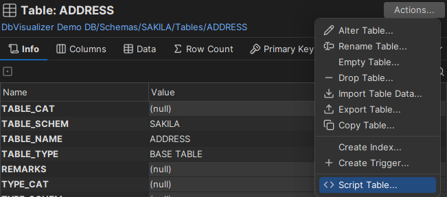
All actions for the Table object in the figure above are defined in the ObjectsActionDef element of the database profile. An action is either defined entirely in XML, or it runs a built-in custom action. The following screenshot shows the dialog for an action defined in XML:
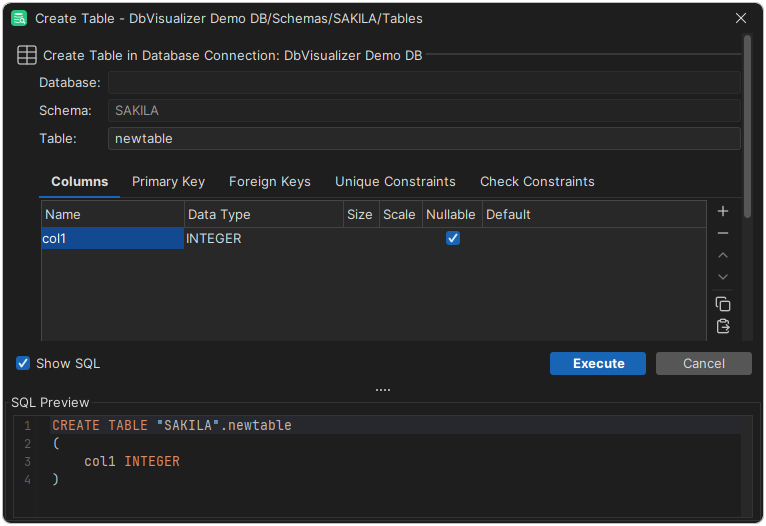
The top of the dialog shows the action label and the database connection of the object. At the bottom, the Show SQL checkbox shows the final SQL for the action. Use the button in the bottom right to run the action (it is labeled Execute or Script, depending on the action mode), or Cancel to close the dialog.
Variables
Variables refer to data for the object that the action was launched for, and to data for its parent objects in the objects tree. Variables also refer to the values that the user enters in the action dialog. You typically use variables in the Command, Confirm, Result and SetVar elements.
The format of a variable is:
${variableName}
The following example is a Rename Table action. It first shows read-only information about the table being renamed. In the last two fields, the user enters the new name of the table: the New Database field is a list of databases, and the New Table Name field is a text field.
If Show SQL is selected, the SQL Preview shows the final SQL as you edit the fields.
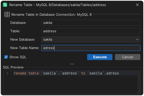
This is the definition of the Rename Table action:
<Action id="mysql-table-rename" label="Rename Table" reload="true" icon="rename">
  <Input label="Database" style="text" editable="false">
    <Default>${catalog}</Default>
  </Input>

  <Input label="Table" style="text" editable="false">
    <Default>${objectname}</Default>
  </Input>

  <Input label="New Database" name="newCatalog" style="list">
    <Values>
      <Command><SQL><![CDATA[show databases]]></SQL></Command>
    </Values>
    <Default>${catalog}</Default>
  </Input>

  <Input label="New Table Name" name="newTable" style="text"/>

  <Command>
    <SQL>
      <![CDATA[
rename table `${catalog}`.`${objectname}` to `${newCatalog}`.`${newTable}`
      ]]>
    </SQL>
  </Command>

  <Confirm>
    <![CDATA[
Confirm rename of ${catalog}.${objectname} to ${newCatalog}.${newTable}?
    ]]>
  </Confirm>

  <Result>
    <![CDATA[
Table ${catalog}.${objectname} renamed to ${newCatalog}.${newTable}!
    ]]>
  </Result>
</Action>
The Action element has attributes for the label of the action, the icon, and whether the objects tree (and the current object view) is reloaded after the action has run.
The Input elements define the fields of the action. The Default element of the Database field contains the ${catalog} variable, and the Default element of the Table field contains the ${objectname} variable. The values of these variables come from the current object in the objects tree (a GroupNode or DataNode). DbVisualizer looks up a variable first among the fields in the action dialog, then in the object that the action was launched for, and then in its parent objects up to the root of the tree. A variable that is not found is replaced with an empty string.
In the example, ${catalog} is the name of the database that the table is stored in, and ${objectname} is the current name of the table. These variables are described in ObjectsTreeDef.
The New Database field is a list of the databases that the SQL command in Values returns. Its default is the current database of the table, from the ${catalog} variable.
The New Table Name field is a text field for the new table name.
The values of the New Database and New Table Name fields are available in the variables named in the name attribute, newCatalog and newTable.
The Command element contains the SQL statement that the action runs. In this example, the SQL combines static text with variables.
XML element - ActionGroup
The ActionGroup element groups ActionGroup, Action and Separator elements. It defines which actions are available for an object type, the order of the actions in the menu, and where the separators are. Nested ActionGroup elements are shown as submenus.
<ActionGroup type="Table">
   <Action id="xxx">
      ...
   </Action>
</ActionGroup>
The attributes of ActionGroup are:
| Attribute | Description |
|---|---|
type | The object type that the action group belongs to. Required for top-level ActionGroup elements, and not used for nested ones. For example, <ActionGroup type="Table"> is shown only when the selected object is a table. |
label | The label of the submenu. Required for nested ActionGroup elements, and not used for top-level ones. |
drop-on-condition | Removes the element when a condition is met. See drop-on-condition in Conditional Processing. |
order-before | Places this element before another element at the same level. The value is an index starting at 0, or the type or id of the other element. For example, order-before="Views" places it before <ActionGroup type="Views">. |
order-after | Places this element after another element at the same level. The value is an index starting at 0, or the type or id of the other element. |
XML element - Action
The Action element defines an action. This is the definition of the Drop Table action for Oracle:
<Action id="oracle-table-drop" label="Drop Table" reload="true" icon="remove">
   <Input label="Schema" style="text" editable="false">
      <Default>${schema}</Default>
   </Input>
   <Input label="Table" style="text" editable="false">
      <Default>${objectname}</Default>
   </Input>
   <Input label="Drop Referential Integrity Constraints" name="cascade" style="check"
      tip="Enable this to drop all referential integrity constraints
               that refer to primary and unique keys in the dropped table">
      <Values>cascade constraints</Values>
   </Input>
   <If test="#util.isDatabaseVersionGTE(10)">
      <Input label="Purge Space" name="purge" style="check"
         tip="Enable this if you want to drop the table and
              release the space associated with it in a single step">
         <Values>purge</Values>
      </Input>
   </If>
   <Else>
      <SetVar name="purge" value="''"/>
   </Else>
   <Command>
      <SQL>
         <![CDATA[drop table "${schema}"."${objectname}" ${cascade} ${purge}]]>
      </SQL>
   </Command>
   <Confirm>
      Really drop table ${schema}.${objectname}?
   </Confirm>
   <Result>
      Table ${schema}.${objectname} has been dropped!
   </Result>
</Action>
The attributes of Action are:
| Attribute | Default | Description |
|---|---|---|
id | Required. Must be unique in the profile and in the profiles it extends. The recommended format is profileName-actionGroupType-action, for example oracle-table-drop. | |
icon | The icon shown next to the label in the actions menu. | |
label | The label of the action in the actions menu and in the action dialog. | |
reload | false | If true, the parent node in the objects tree is reloaded after the action has run. Use it for actions that add, remove or rename objects. |
mode | execute | How the action runs, see Action modes. |
resultaction | How result sets are shown, see Result sets. | |
resulttarget | Set to editor to open the result in a new SQL Commander tab, see Result sets. | |
hideif | A condition that is evaluated when the actions menu is created. If it is true, the action is not shown. For example, hideif="#dataMap.get('actionlevel') neq 'toplevel'". | |
resetcatalogs | false | If true, the cached databases for the connection are reset. Use it for actions that create, rename or drop a database. |
resetschemas | false | If true, the cached schemas for the connection are reset. Use it for actions that create, rename or drop a schema. |
supportsmultipleobjects | true | Set to false to turn off running the action on several selected objects, see Running an action on several objects. |
class | A built-in custom action, such as tableCreate or tableExport, or a Java class that implements the action. | |
classargs | Arguments for the custom action. | |
doclink | A key for a link to the user guide, for example dbvis.url.ug.export-table. | |
drop-on-condition | Removes the element when a condition is met. See drop-on-condition in Conditional Processing. | |
order-before | Places this action before another element at the same level. The value is an index starting at 0, or the id or type of the other element, for example order-before="oracle-table-drop". | |
order-after | Places this action after another element at the same level. The value is an index starting at 0, or the id or type of the other element. |
Some built-in custom actions, such as tableCreate, tableAlter, tableExport and tableDataImport, are available only in DbVisualizer Pro.
Action modes
The mode attribute can have these values:
| Value | Description |
|---|---|
execute | The default. Shows the action dialog and runs the SQL when you click Execute. |
script | Shows the action dialog. When you click Script, the final SQL is loaded into SQL Commander without being run. |
script-immediate | Doesn't show the action dialog. The final SQL is loaded into SQL Commander without being run. |
Result sets
By default, each result set from an action is shown in its own tab. Use resultaction to merge the result sets:
| Value | Description |
|---|---|
mergeastext | Merges all result sets into a single result tab. |
mergeasscript | Merges all result sets into a single result tab, with each row ending with the SQL statement delimiter (; by default). |
With resulttarget="editor", the merged result is opened in a new SQL Commander tab instead. If resultaction isn't set, the result sets are merged as text.
Running an action on several objects
You can run an action on several selected objects at once if all its Input elements have one of these styles: check, check-list, list, radio, separator, label, note, or text with editable="false". Set supportsmultipleobjects="false" to turn this off for an action.
XML element - Input
An Input element defines a field in the action dialog. The label attribute is shown to the left of the field. If there is no label, the field uses the full width of the dialog. Fields are editable by default, except for the list style. An editable field needs a name attribute, which is the name of the variable that holds the value.
| Attribute | Default | Description |
|---|---|---|
label | The label of the field. | |
name | The name of the variable that holds the value of the field. | |
tip | The tooltip of the field. | |
editable | true (false for list) | Whether the user can edit the field. |
required | false | If true, the Execute button is disabled until the field has a value. |
linebreak | Places several fields on the same row, see the example below. | |
style | text | The style of the field: text, password, number, text-editor, wrapped-text-editor, check, check-list, list, radio, grid, separator, label, note or file-chooser. See the sections below. |
hideif | A condition that is evaluated when the action dialog is created. If it is true, the field is not shown. For example, hideif="#dataMap.get('actionlevel') neq 'toplevel'". | |
runsetdefaultwhenvaluechanged | The names of other fields, separated by commas. When the value of this field changes, the Default of those fields is evaluated again. |
This is a minimal field definition. It shows a read-only text field labeled Size.
<Input label="Size" editable="false"/>
An editable field needs the name attribute, which is the name of the variable for the value.
<Input label="Size" editable="true" name="theSize"/>
Use the tip attribute to describe the field. It is shown as a tooltip.
<Input label="Size" editable="true" name="theSize" tip="Enter the size of the new xxx"/>
Use the hideif attribute to show a field only in some cases. The condition uses the same syntax as described in XML element - SetVar. Example:
<Input label="Unit" hideif="#dataMap.get('actionlevel') neq 'toplevel'"/>
By default, each field is on its own row. To place several fields on one row, set linebreak="false" on the first field of the row, and linebreak="true" on the last one.
<Input name="size" label="Size" style="number" linebreak="false">
  <Default>10</Default>
</Input>
<Input name="unit" label="Unit" style="list" linebreak="true">
  <Labels>KB|MB</Labels>
  <Values>K|M</Values>
  <Default>M</Default>
</Input>
In this example, the Size number field and the Unit list are on the same row.
You can set the default value of a field from the result of an SQL statement:
<Input label="Size" editable="true" name="theSize">
   <Default>
      <Command>
         <SQL>
select size from systables where tablename = '${objectname}'
         </SQL>
      </Command>
   </Default>
</Input>
The Default element above runs the SQL statement and uses the value in the first column of the first row as the default value. You can use SQL in Default for all styles, and in Values and Labels for the list, radio and check styles.
Sometimes you can't write an SQL statement that returns only the column you need, for example when the data comes from a stored procedure. Then use the column attribute to pick the column by name or by index.
By column index (column="2"):
<Input label="Size" editable="true" name="theSize">
   <Default column="2">
      <Command idref="getSize">
         <Input name="objectname" value="${objectname}"/>
      </Command>
   </Default>
</Input>
By column name (column="THE_SIZE"):
<Input label="Size" editable="true" name="theSize">
   <Default column="THE_SIZE">
      <Command idref="getSize">
         <Input name="objectname" value="${objectname}"/>
      </Command>
   </Default>
</Input>
Instead of writing the SQL in the element, you can refer to a command using the idref attribute:
<Input label="Size" editable="true" name="theSize">
   <Default>
      <Command idref="getSize">
         <Input name="objectname" value="${objectname}"/>
      </Command>
   </Default>
</Input>
Refer to commands using the idref attribute when the same SQL is used in several actions. Use Input elements in the Command to pass parameters to the command.
The following sections describe the styles of the Input element.
Style - check (true/false, on/off, selected/unselected)
The check style is a checkbox, for yes/no input. If the checkbox is selected, the variable is set to the value in Values. If it is not selected, the variable is empty.
<Input label="Cascade Constraints" name="cascade" style="check">
   <Values>compact</Values>
</Input>
- This creates a checkbox labeled Cascade Constraints.
- If the checkbox is selected, the
cascadevariable is set tocompact. - If the checkbox is not selected, the variable is empty.
Style - check-list (large number non exclusive choices)
The check-list style is like the list style, but each choice has a checkbox, so the user can select several values.
<Input label="Weekdays" name="weekdays" style="check-list">
   <Arg name="output" value="jschours[${value}] = true"/>
   <Arg name="newline" value=", "/>
   <Labels>Monday|Tuesday|Wednesday|Thursday|Friday|Saturday|Sunday</Labels>
   <Values>00|11|22|33|44|55|66</Values>
   <Default>22|44</Default>
</Input>
The output argument defines how each selected choice is written in the final value, and the newline argument defines the delimiter between the choices. In the example, each choice is written as jschours[22] = true. If the user selects Monday and Friday, the value is:
jschours[00] = true, jschours[44] = true
Style - grid (configurable multi row/columns input)
The grid style shows a grid with controls to add, remove and move rows. You define the columns of the grid using nested Input elements with the text, number, password, check, list or radio style. Use the grid style when the user can enter several entries, for example the columns of an index or the data files of a tablespace.
This example asks for the parameters of a procedure in a create procedure action:
<Input name="parameters" style="grid">
   <Arg name="output" value="${direction} ${name} ${type}${_default}"/>
   <Arg name="newline" value=", "/>

   <Input name="name" label="Name" style="text">
      <Default>p1</Default>
   </Input>
   <Input name="direction" label="Direction" style="list">
      <Values>IN|INOUT|OUT</Values>
      <Default>IN</Default>
  </Input>
  <Input name="type" label="Type" style="text">
      <Default>VARCHAR(20)</Default>
  </Input>
</Input>
This is the result:
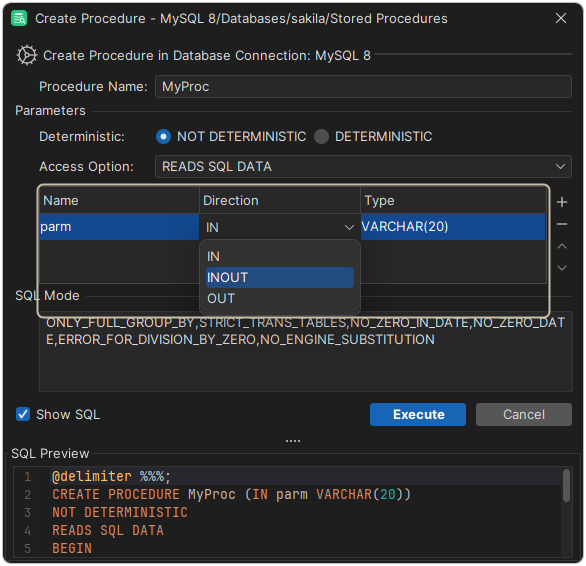
The nested Input elements define the columns of the grid, from left to right.
The example has no label attribute, so the grid uses the full width of the action dialog. The grid style supports these Arg elements:
output: The output format for each row in the grid. The value can contain variables and static text. For conditional output, see theSetVarelement below.newline: The text that separates the rows. A\nin the value is converted to a newline.rowprefix: A prefix for each row.rowsuffix: A suffix for each row.
The resulting parameter list is stored in the variable named in the name attribute, parameters in the example.
In a grid, a SetVar element processes the data of each row before it is written using the output argument. For example, to add the word default only if the user entered a value in a Default column:
<SetVar name="_default" value='#default.equals("") ? "" : " default " + #default'/>
If #default is not empty, the text default is added before the value. The result is stored in the _default variable, which the output argument above refers to.
Style - label
Use the label style when the standard label to the left of the field should not be shown. The following example shows seven checkboxes on the same row, each with its own label.
<Input style="label" linebreak="false"/>
<Input label="Mon" name="mon" style="check">
   <Values>mon</Values>
</Input>
<Input label="Tue" name="tue" style="check">
   <Values>tue</Values>
</Input>
<Input label="Wed" name="wed" style="check">
   <Values>wed</Values>
</Input>
<Input label="Thu" name="thu" style="check">
   <Values>thu</Values>
</Input>
<Input label="Fri" name="fri" style="check">
   <Values>fri</Values>
</Input>
<Input label="Sat" name="sat" style="check">
   <Values>sat</Values>
</Input>
<Input label="Sun" name="sun" style="check">
   <Values>sun</Values>
</Input>
Style - list (large number of exclusive choices)
The list style shows the choices in a drop-down list. The user can select one choice.
<Input label="Select index type" name="type" style="list">
   <Values>Pizza|Pasta|Burger</Values>
   <Default>Pasta</Default>
</Input>
In Values, separate static choices with a vertical bar (|). Default is either the default choice or its index, starting at 0. In the example above, <Default>{2}</Default> selects Burger.
You can also use the Labels element. It lists the choices as they are shown in the action dialog, while Values lists the values that are used in the variable.
<Input label="Select index type" name="type" style="list">
   <Values>Pizza|Pasta|Burger</Values>
   <Labels>Pizza the French style|Pasta Bolognese|Texas Burger</Labels>
   <Default>Pasta</Default>
</Input>
If the user selects Texas Burger, the type variable is set to Burger.
This example gets the choices from SQL:
<Input label="New Database" name="newCatalog" style="list">
   <Values>
      <Command>
         <SQL>
            <![CDATA[
show databases
            ]]>
         </SQL>
      </Command>
   </Values>
   <Default>${catalog}</Default>
</Input>
The Command element in Values runs the show databases statement, and the list shows the result.
A list is not editable by default. To let the user type a value, set editable="true".
Style - note
The note style is a text label that you can place after a field, typically together with the linebreak attribute.
<Input label="Sleep Between Each Statement" name="sleep" style="number" linebreak="false">
   <Default>1000</Default>
</Input>
<Input label="millis" style="note" linebreak="true"/>
This is how the example looks:

Style - number
The number style is a text field that accepts only whole numbers.
<Input label="Size" name="size" style="number" editable="true"/>
Style - password
The password style is a text field that masks the value.
<Input label="Password" name="pw" style="password" editable="true"/>
Style - radio (limited number of choices)
The radio style shows the choices as radio buttons. It differs from the list style in these ways:
- All choices are shown at once, so use it only for a few choices.
- Add
<Arg name="direction" value="vertical"/>to show the choices vertically. By default, they are shown horizontally.
Otherwise, the radio style works like the list style.
Style - separator (visual divider between input controls)
The separator style is not a field. It is a line that divides the fields in the action dialog. If the label attribute is set, it is shown to the left of the line.
<Input label="SQL Mode" style="separator"/>
A separator can replace the standard label to the left of a field. Here is an example:
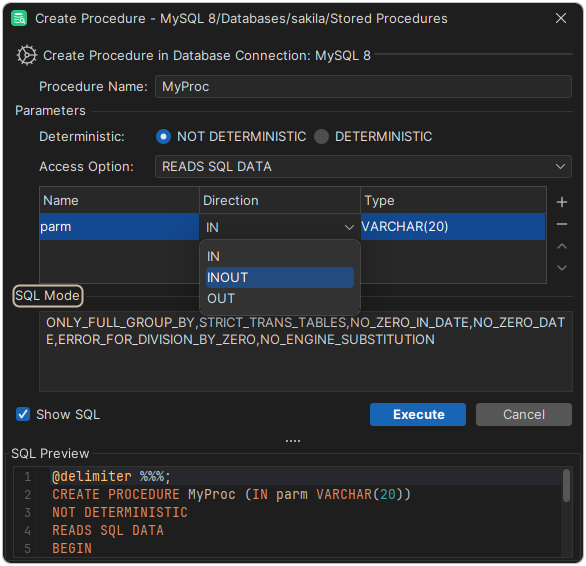
The Parameters and SQL Mode separators are used as labels for the fields below them, which use the full width of the dialog.
Style - text (single line)
The text style is a single-line text field.
<Input label="Enter your userid" name="userid" style="text">
   <Default>agneta</Default>
</Input>
- The optional
Defaultelement sets the default value. It can contain variables, static text andCommandelements. - A text field is editable by default. To make it read-only, set
editable="false".
Style - text-editor (multi line)
The text-editor style is like the text style, but with several lines.
<Input label="Description" name="desc" style="text-editor" editable="true">
   <Arg name="height" value="30"/>
</Input>
The height argument sets the height of the field in dialog units (DLU). The default is 50.
Style - wrapped-text-editor (multi line)
The wrapped-text-editor style is like the text-editor style, but it wraps long lines.
Style - file-chooser
The file-chooser style is a text field with buttons to select a file and to pick a recent file.
<Input label="File Name/Path" name="file" style="file-chooser">
    <Default></Default>
</Input>
This is how the example looks:

XML element - SetVar
The SetVar element creates a variable from other variables or static text. You can use it for conditional processing.
For example, this is an SQL statement that creates a user:
CREATE USER 'user' IDENTIFIED BY 'password'
The user name is required, so it maps directly to an Input element. The password is optional, so the IDENTIFIED BY clause should only be in the final SQL if the user enters a password. You solve this using SetVar:
<Action id="mydb-user-create" label="Create User" reload="true" icon="add">
   <Input label="Userid" name="userid" style="text"/>
   <Input label="Password" name="password" style="password"/>

   <SetVar name="_password" value='#password.equals("") ? "" : " identified by \"" + #password + "\""'/>

   <Command>
      <SQL>
         <![CDATA[
create user ${userid} ${_password}
         ]]>
      </SQL>
   </Command>
</Action>
The attributes of SetVar are:
| Attribute | Description |
|---|---|
name | The name of the new variable. |
value | The expression to evaluate, in OGNL syntax, which is similar to Java. Refer to variables as #variableName. |
action | Optional. In an action, set it to runwheninit to also evaluate the SetVar when the action dialog is created. The values show, hide and drop apply to SetVar in ObjectsTreeDef. |
The expression in the example checks whether the password variable is empty. If it is, _password is set to an empty value. Otherwise, _password is set to identified by "thePassword".
The SQL in the Command element refers to the new ${_password} variable instead of ${password}.
Start the names of variables created using SetVar with an underscore (_), to show where they come from.
Variables with 'password' in their name are masked in the SQL Preview.
XML element - Confirm
The Confirm element is a message that is shown when the user runs the action. If the action has only read-only fields, the message is shown in the action dialog. Otherwise, it is shown in a confirmation dialog.
<Confirm>Really drop table ${table}?</Confirm>
The message can contain HTML tags such as <b>, <i> and <br>.
XML element - Result
The Result element is an optional message for a successful run of the action.
DbVisualizer doesn't show Result messages.
<Result>Table ${table} has been dropped!</Result>
XML element - Command
The Command element contains the SQL that the action runs.
<Command>
  <SQL>
    <![CDATA[
drop table ${table} mode ${mode} including constraints ${includeconstraints}
    ]]>
  </SQL>
</Command>
For more information, see Commands.
XML element - Message
The Message element defines a message that is shown at the top of the action dialog.
<Message>
    <![CDATA[<html>
This action will be <b>deprecated</b> in a future version as it use database calls that has been declared by the database vendor as <b>extremely bad performing</b>.</html>
    ]]>
</Message>
The message can contain simple HTML tags.
Action showing just a message
An action can show only a message in a dialog with an OK button. For example, when the user lacks the privileges to run an action, you can show a message instead.
To do this, define an Action with only a Confirm element. Example:
<If test="#SUPERUSER">
   <Action id="vertica-table-analyze-workload" label="Analyze Workload For Table">
      <Input label="Schema" style="text" editable="false">
         <Default>${schema}</Default>
      </Input>
      <Input label="Table" style="text" editable="false">
         <Default>${objectname}</Default>
      </Input>
      <Command>
         <SQL>
            <![CDATA[SELECT analyze_workload('${schema}.${objectname}')]]></SQL>
      </Command>
      <Confirm>
         Really Analyze Workload on ${schema}.${objectname}?
      </Confirm>
   </Action>
</If>
<Else>
   <Action id="vertica-table-analyze-workload-INFO" label="Analyze Workload For Table">
      <Confirm>
         <![CDATA[
            This feature requires the <b>super user</b> authorization.
         ]]>
      </Confirm>
   </Action>
</Else>